Reporting has been a fact of business life probably since early Phoenician traders wrote their sales figures and customer feedback on parchment as they traversed the Middle East and the Mediterranean Sea in search of customers more than a thousand years BC. Back then, a sales-qualified lead (SQL) was a personal introduction in the back room of a smoky Middle Eastern tea house, while data sources were talkative Bedouin who had just arrived by camel-train from a distant North African land. Data visualisation likely took the format of columns of numbers etched onto a scroll.
Arguably, the first smart reporting tool was the humble Microsoft Excel spreadsheet that debuted more than 30 years ago. Today it is still an entry point for many small business users requiring simple data entry and analysis. But while Excel did the job for many years, this approach requires a level of human input that can be slow and subject to error. The distribution of data also tended to be to a limited number of decision-makers and the content was far from being real-time.
Nowadays, the tools that business professionals use in their day-to-day working environment likely have some form of built-in reporting function, but these are typically more suited to ad hoc reporting interpretation rather than for rapidly conveying unified, enterprise-wide, data and insight.
As data requirements become more complex and big data generates a terabyte-scale of info and metrics every second of the day, the requirement for more advanced marketing reporting software has become obvious. Making rapid and real-time decisions based on up-to-date insight provides a clear competitive advantage, which we'll explain later in the article. This need has caused businesses to search for more complex solutions that can make sense of the big data around them feeding into their competitive intelligence databases.
Business intelligence questions that can be answered immediately and with all-important accuracy by reporting tools can be the difference between success and failure. It therefore brings little surprise that two-thirds of executives are expected to increase IT budgets in 2021.
Reporting tools go by a range of names, we've detailed some of them below. Whatever the name, they all come down to the same thing: collecting large quantities of information quickly in order to find meaning and insight.
- Software reporting tools
- Reporting software
- Reporting systems
- Business intelligence software
- Data Reporting
- Information visualization software
- Business intelligence and reporting tools (BIRT for short)
- Enterprise reporting software tools
Table of Contents
Understanding software reporting tools in more detail
What are the different types of reporting software tools?
Examples of specific reporting options and use cases
Getting the best out of dashboard reports
The final word on reporting
Understanding software reporting tools in more detail
Before we get into reporting tools, let's first clear up what we mean by reporting since there are so many different types. In this article, we'll be solely focusing on Enterprise reporting and this definition by Gregory Hill summarises this form nicely:
Enterprise reporting (or management reporting) is the regular provision of information to decision-makers within an organisation to support them in their work.
The Digital Project Manager, for example, provides the following definition: “A reporting tool, or reporting software tool, is a system that takes in data from various sources and extrapolates it in tables, charts, visual presentations, and other styles so that the information is easier to parse.”
InetSoft Technology Corp defines reporting software as: “Applications that provide enterprises with various reports about their businesses. [These] can range from sales to production reports, to ad hoc reports [or] reports in which the user customizes the queries, perhaps for a specific problem. Primarily, reporting tools hub essential data from every corner of the enterprise and then present the data in a meaningful way to employees and decision-makers.”


What questions reporting tools should answer
Good reporting software tools should be able to tell us just about anything we need to know. That being said, we're a big fan of the mantra "measure what matters". Not everything that can be measured should be measured; any wise executive will explain the importance of using reporting tools to measure strategic goals and the long-term organisational objective. With this in mind, here are a few metrics we'd recommend keeping an eye on.
Examples of KPI reporting metrics to analyze
The following are examples of key metrics that will assist high-level measurement:
- Staff KPIs
- Financial KPIs
- Sales KPIs
- Marketing KPIs
- Social media KPIs
- Competitor KPIs benchmarks
Since there's such a vast amount of data available to measure these days, professionals can easily feel overwhelmed. To prevent this, data visualization is key. Mere data reporting without applying data analysis and visualization to find meaning in the numbers is pointless.
To take analysis further and add a layer of insights, many companies employ (or outsource) data analysts or use automated processes such as embedding visualization reporting tools. The latter can be integrated with standardised templates that have a pre-determined format and structure for regular, easy-to-use, reports. If data need is more bespoke, there are plenty of vendors out there that offer custom dashboards.
Tip: Have you considered using image recognition to add more data into your reporting?
What are the different types of reporting software tools?


Now that we have an understanding of what BI tools can do to maximise our measurement requirements and track key performance indicators across the entire business, it’s important to understand that there is not just one type of reporting software tool available.
There are many types of reporting tools, such as dashboard software, data visualization software, scorecard tools and ad-hoc report writers.
Dashboard software lets us put the reports that matter most to us front-and-centre; data visualization software is all about turning data into something visually oriented that users can easily read. Scorecarding tools, however, are all about performance data so we know who our high achievers are, and ad-hoc report writers create various styles of reports in the moment for companies who have ever-changing needs.
Reports can also vary in their interactivity too. Static documents cannot be changed by the end-users, while interactive measurement options allow us to navigate through various hierarchies and visualisation elements. Interactive reports allow us to drill down through various levels of the data at the click of a button. They also allow us to navigate, sort, filter and view the data sources for our specific needs.
Delivery mechanisms can vary as well. Common export and delivery options include delivering reports via email, .pdf, different excel formats, .csv, or via FTP. Most Enterprise tools will work with us to figure out the format that best suits our business need.
Tip: Image recognition software adds to your dataset.
What makes a best-in-class reporting tool?
Essentially this is about making it as easy as possible to translate large volumes of data from multiple data sources into actionable info. ‘Easy-to-use, ‘simple to understand', ‘intuitive to operate’ and ‘easy to visualize’ are all phrases that spring to mind here.
Given that data scientists and data analysts are expensive and in short supply, a tool that incorporates self-service business intelligence is a huge plus for management. The goal of self-service BI is to make business users become self-reliant and less dependent on their IT organisations to answer business questions as they arise. In many cases, IT provides these analysis tools and applications to the business, but when an employee needs that data and information, they can source it themselves.
Ben Aston, Founder of Vancouver-based indie digital media publishing company, Black and White Zebra, lists the following as among his top requirements for a tool:
- Are the reports aesthetically pleasing and easy to interpret?
- Is the tool usable and easy to learn?
- Can the data be visualized in a variety of different ways?
- Can we measure it in different ways?
- Can we export, print, and share the content with relative ease?
- How easy is customisation and visualization?
- Are the dashboards interactive?
- Is it an all-in-one tool that can pull data from different types of data sources, from web reports to web pages, to spreadsheets, apps or accounting software?
- Is data easy to search using both technical and non-technical language and specifications?
- Are there different ways to ‘ask questions around the data', depending on user ability or preference?
People also ask the following reporting based questions:
What is a report writer?
Also called a report generator, this program is usually part of a database management system that extracts information from one or more files and presents the information in a specified format. Most reporting tools allow us to select records that meet certain conditions and to display selected fields in rows and columns.
What is report writing software?
Report writing software consists of programs that produce both periodic and special reports. These may be issued weekly, quarterly, or annually. There may also be unscheduled data reporting requested by managers.
What makes a good reporting tool?
Good dashboards display data, but a great dashboard is interactive. In reality, visual data reporting goes deeper. It not only gives us data, but also lets us interact with it. The ability to interact with the information in front of us helps users understand the data better and enables us to take action.
What's the best way to share report information?
This really depends on what's being reported on. For example, if the info could be used across multiple departments, it might be useful to create newsfeeds updating staff on the company intranet. Alternatively, many companies create command centres and offer all departments access to the data. If the info is sensitive, a dashboard that only a select few people have access to will be more suitable.
Examples of specific reporting options and use cases


Now that we have a thorough understanding of reporting software tools, the capabilities that separate the good from the mediocre, what they can do, and the solutions that they can bring to the table, let’s examine some specific options and use cases.
Using KPI reports to measure Marketing KPIs
Tip: Take a look at the findings of the biggest Global Digital Report 2023, and download the whole Global Digital Report 2023 here.
KPI reports that really matter and how to track them
Everyone needs something to strive for to keep them on track. Key performance indicators (KPIs) are a great way to make goals more tangible and quantify what was up until now unquantifiable. When we (or our boss) are wondering if we're doing a good job, KPI reports are there to answer the question and nudge us to even greater heights.
If we're working in the PR and marketing environment, for example, our leadership team doesn’t want a dashboard that’s merely a list of links to PR clips and some social media snapshots. They want a KPI report that enables management to understand how their investments in Paid, Earned, Shared and Owned (PESO) media — and the comms team — are supporting their wider business goals.
Yes, many of our goals centre around eyeballs and engagement. But to prove our worth to the leadership team, we also need to measure the right KPIs. Here’s how to get started on a marketing KPI report.
The challenge of setting globally standardised KPIs
Standardising performance indicators across our organisation is challenging, especially if we're overseeing a multi-region operation. What may be a good KPI in one region could, due to differing circumstances and cultural norms, not make for a great KPI report in another region.
In some regions, standardized measurement and a focus on ROI is not the norm for communications teams. If we are used to being measured on awareness and impressions, the boards attempt to deploy a standardized dashboard can be seen in a negative light. That’s why it’s important to align our teams and create buy-in on the reasons behind globally standardized KPIs. Doing so will also highlight how each regional team’s activities can affect the global brand sentiment and overall sentiment. With this groundwork in place, comms professionals can amplify team efforts, more effectively deploy resources, and develop a more cohesive brand identity.
Setting Key Performance Indicators for our team and our company
Most people who run a business or a team in a large company struggle when it comes to setting Key Performance Indicators for KPI reports.
One of the great things about KPIs for our team is that it makes one-on-ones easier as we have timelines and progress of key indicators to track and discuss. It also keeps our team focused on what MUST be done, even if they aren’t there to oversee. Basically, the KPI report is our proxy when we can’t be everywhere at the same time.
Here are three steps for setting KPIs for your team. Follow this step-by-step approach and the KPI report process will become much easier.
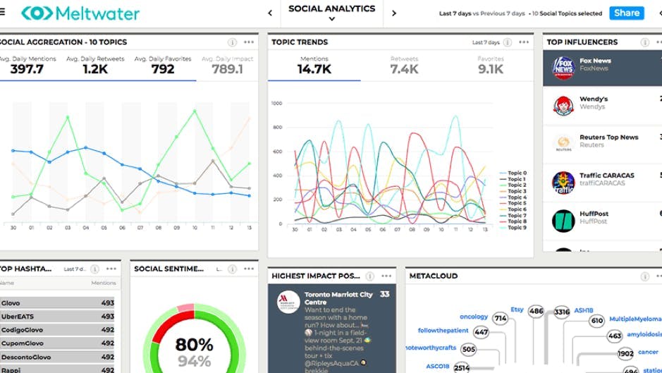
Getting the best out of dashboard reports
Dashboards are integral to getting the best out of our data reporting. Whatever the metrics we're tracking – whether it's business intelligence, SQL, the performance of people within the business, customer lifetime value or conversion rate of SQLs – a marketing dashboard becomes an automated oracle.


Dashboards are always available to help out with everything from content marketing ideas to competitor intelligence and general business intelligence – when they’re done right and designed with clear intention. There are brand, competitor, industry and many other types of dashboards.
With the right KPI marketing dashboard, we'll be armed with analytics that help us understand where our brand is at, how it stacks up against the competition, and where it’s performing in our industry. The next step is to translate that dashboard data into winning PR, communication and marketing strategies.
Why we should use customised manual reports
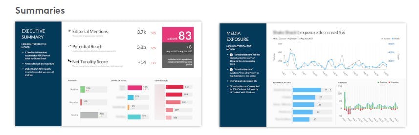
While quantitative media analysis helps companies understand the ‘what’, sometimes it can be tricky to get to grips with the ‘why’ without the help of bespoke reports that lean on human qualitative media analysis. Qualitative media analysis gives context to the numbers so that business users can make objective strategic decisions. If reporting isn't your forte, fear not. Meltwater's team of experienced analysts can support.
We work with our client's requirements to curate and deliver custom reports based on their specifications and KPIs. Unlike standard dashboard reports, Meltwater's custom reporting services allow users to pick and choose which metrics and analytics are analyzed, rather than using templatized report options. What's more, unlike standard reports, our custom reports are delivered, ready to present, in the format our clients require, without any heavy lifting on their side.
Since customized manual reporting is bespoke, use cases are extremely varied. Whether we want to harness our consumer voice to inform product development, understand trends to make sure our brand stays relevant, or keep tabs on our competitor's movements so we can stay agile – custom reports are built to ensure we’re covered on all levels.
Often management relies on manual customized documents to streamline its reporting efforts and:
- Analyze key business drivers
- Uncover trends
- Discover threats and opportunities
- Benchmark against competitors
- Understand strategic insights such as new market entry
- Measure business impact
- Gain a comprehensive health check on the brand, product portfolio, industry, and competitive position
- Understand the context of business-critical media
- Gather other forms of business intelligence
Optimising inbound marketing reporting

Inbound marketing reporting is important because it connects the dots between our marketing activities and the goals we set out to accomplish. It can help us draw conclusions from our tests, learn from our mistakes and spot opportunities to replicate success. Inbound marketing reporting can also help us prove the ROI of inbound marketing efforts and eliminate wasteful activity.
Simply put, proper inbound marketing reporting gives us a blueprint for success when it comes to growing the business through inbound strategies. But we don’t have to wait until the end of the month to analyze our progress. We can break our reporting down into daily, weekly, or any other time frame that suits our business intelligence needs.
Inbound marketing metrics to monitor
- Web reports detailing website traffic for particular time frames
- Blog traffic
- Page performance
- Marketing leads generated during stipulated time frames
- Lead-to-customer rate
- Monitoring sales-qualified leads (SQLs)
Tracking social media metrics to measure client goals
In 2021, social media is no longer an alternative world that people plug in to, but rather an extension of the world that we already live in. Our social media presence reflects who we are and who we want to be.
For a business, letting someone run our social media pages for us is a crucial responsibility. However, it can often be difficult for both parties to be objective in determining the effectiveness of campaigns and brand-building efforts. Choosing the right social media metrics is therefore vital.
At first glance, metrics such as engagement rates and click-throughs may seem like the right decision. However, while all metrics are helpful for different reasons, savvy marketers and their agencies should be able to justify why the metrics they’ve chosen are best suited for monitoring specific marketing goals.
Once we know we're on the right track, we can conceptualise creative content and map out media placements without worrying that we're missing the mark.
The final word on reporting

Smart reporting using best-in-class reporting tools makes for a successful business. Reporting tools are not merely a way to monitor and run our business on a daily, weekly or monthly basis. They also give meaning to the data sources and provide insight as to the next key steps required to stay ahead of the curve, as well as giving a strategic real-time overview of the organisation.
Want to learn more about setting up marketing, comms and PR reports and dashboards - and how to use them to maximum benefit? Meltwater's reporting services team can help. Simply fill out the form below to learn more.